We as PaperKite-ians are constantly challenging ourselves to discover new technology. As the age of Virtual Reality (VR) dawns with tools like Google Cardboard making it far more accessible, so too does our desire to discover it.
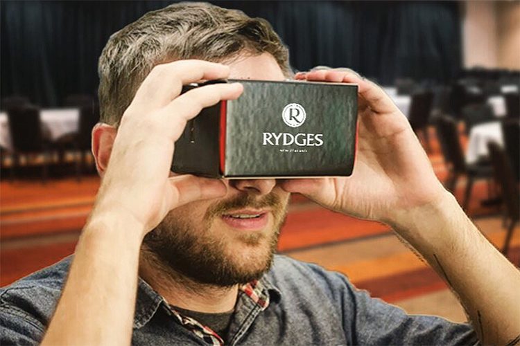
In 2016 Rydges Hotels came looking for an App that would completely blow away their competition and give them a boost in the market. We seized the opportunity with arms wide open. “Let’s create a Google Cardboard App where the user can explore and experience Rydges Hotels without ever having to leave their chair,” we whispered, excited tears swimming in our eyes. And that we did.
Below are lessons learnt along the way and some tricks we’ll be using in all future VR Apps we make.
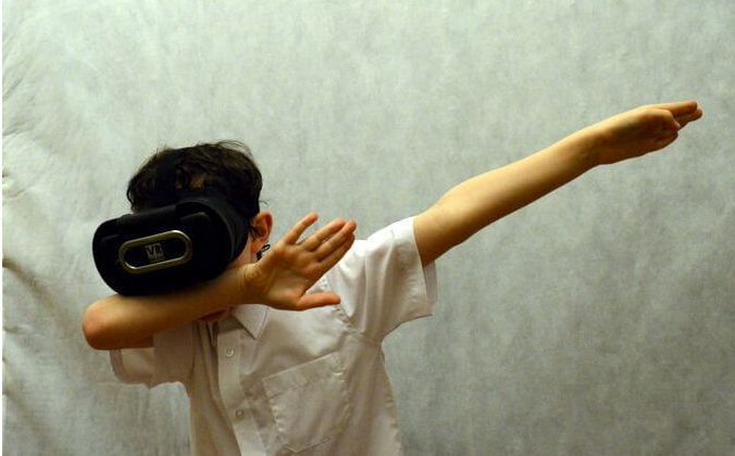
(In case you thought that said dabbing).
The first problem we needed to address: our users were “dumb”. Most of them, if not all, would have never entered a virtual world before. This became a positive because the technology was new and exciting, but a negative that the user would be unfamiliar with any 3D interface. An exciting challenge we decided, as we turned to games for inspiration. It made sense to look to games as these are the primary Applications in the VR market. Making them an important asset to discover what is currently working, and what isn’t.

After some exploration a major problem we noticed was the quality of display. On lower resolution devices pixels are noticeable and smaller details become indistinguishable. This is important to note as it means text and smaller icons need to be bolder, larger and have a high contrast.
In the real world, text and icons need to be a certain size and distance from the user for them to be readable. This research has already been done for advertising material such as billboards and posters. If you’re interested in learning more about this you’ll gain great insight by reading this article. In summary, humans feel most comfortable looking at/reading an object 10–20 metres away from them. This is a concept that should be carried over to your virtual world.
Once our icons were visible and readable the next problem to address was interaction. VR interaction is very different to the usual Apps we build as there is a very limited interface to interact with. We would be relying on the user’s head movements and the one physical button on a Google Cardboard headset. Taking cues from our earlier game exploration we found the most intuitive interaction was a hover. If the user hovered over a button on screen a two second timer would begin and once completed would activate the button. If the user were to look away before the timer reached completion nothing would activate. For impatient users, they could click the physical Google Cardboard button before the timer completed to activate the button sooner. This solution was simple, effective and easy to understand for all users.
But as is often the case, once one solution is reached many issues arrive with it. If the user arrived in a new scene and their eyes (or from the technology’s point of view, the centre point) landed directly on a button, the timer would trigger immediately. The user would be left confused and flustered when said button would action without their intent. This meant we needed to be very careful when placing icons on screen and it was important to make sure all icons were out of a natural line of sight. Because we had control over which direction the user would look when they arrived in the scene, we were careful to ensure they always arrived looking away from all buttons.
As we continue to work with Rydges in a VR space we will learn more tricks along the way. Documenting our learnings is a good way to remember them for future projects, and hopefully will help someone hoping to work with a VR interface.
New digital project? Keen to optimise your existing digital project? We’re always keen to talk.
Made with ♡ in Wellington
© 2020 PaperKite